Animation Breakdown: Rose: Strife.
Hey, My name is Boogs and today I'm going to methodically break down the animation of Page 1582 of Homestuck,
> Rose: Strife.
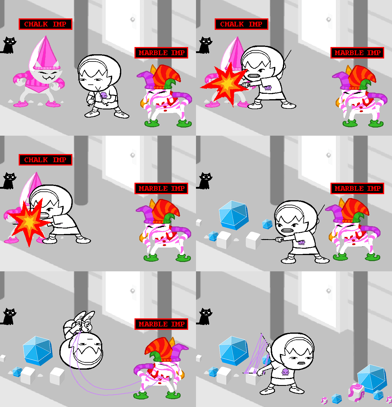
This is a hand-crafted, extremely detailed 57-frame BEHEMOTH of a GIF.
Not made in Flash, all by moving and alternating layers in Photoshop CS3 on some day of March of 2011.
As with all of these panel breakdowns, I’m going to break down every frame of this animation, usually in small chunks, slowed down and trimmed using the genuinely excellent tool of ezgif.com. I can label frames by order, make them fade into each other, and lots of other useful stuff.
If you haven’t first read my introduction to MSPA guide, and don’t know what’s a tickback frame, for example,
you should go over that in here first.
Now, here’s the GIF slowed down to half speed, with all frames labeled in order.

Now for specifics.
The gif opens on 5 frames, the first being 0.2s long, the other 4 0.1s, making for a 0.6 second long idle pose loop. I also have a document analyzing Idle animations across Homestuck, where I go into further detail on a similar (near identical) Rose idle pose.

Starting off with an idle is smart, as it tunes the viewer into strifing mood, since that’s how all Strife animations start out.
Frames 5 to 17 include a shockingly sensible arcing arm movement, which is interesting:
Arms are so often abstracted out of the MSPA art style for their unneeded complexity, that seeing such a clear arcing motion is a sight to behold.
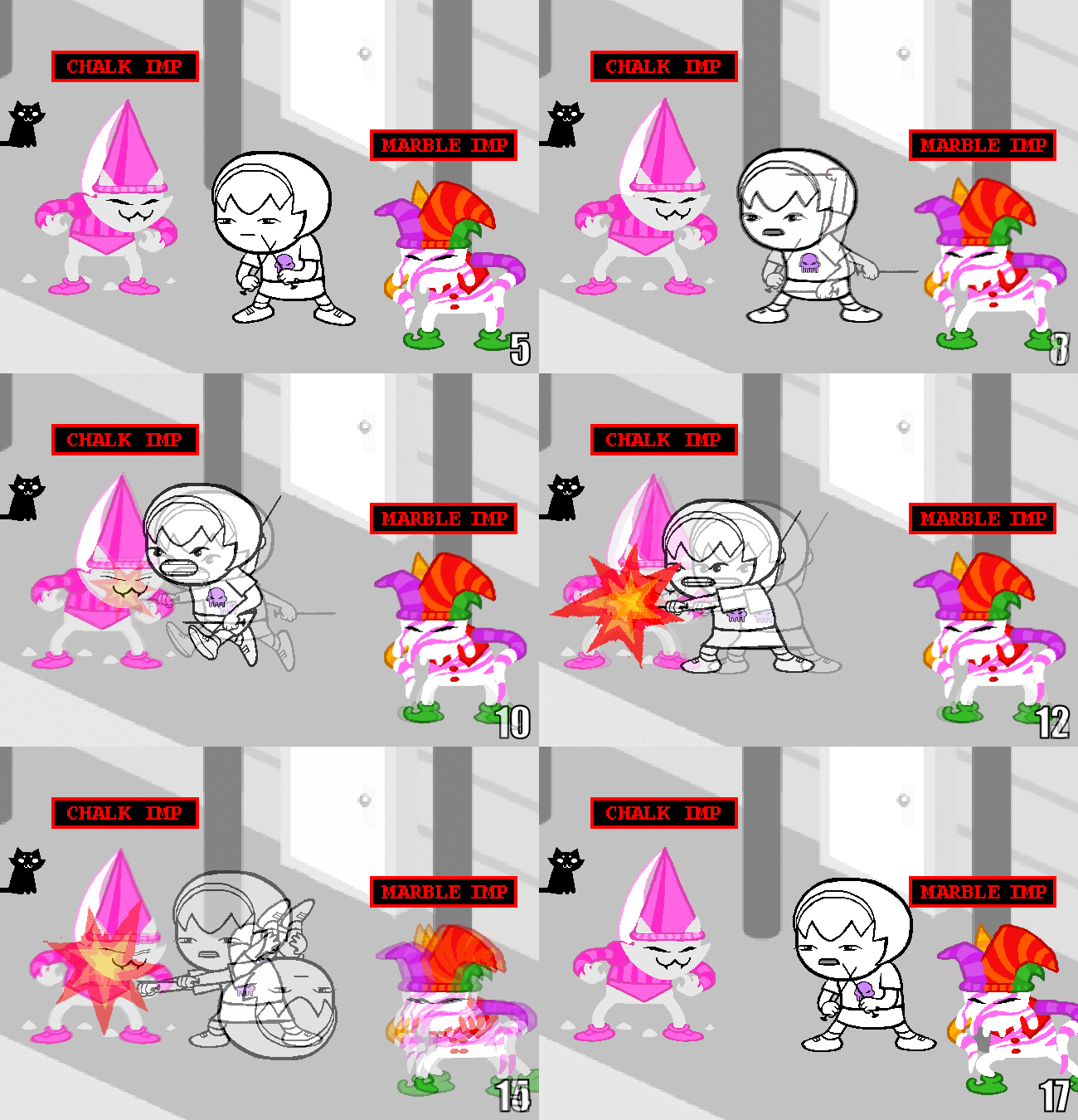
This excellent use of premade poses to make such a fluid, dynamic scene is why I keep insisting on preparing your sprites with a bathtub full of poses and positions.
Even I never bother making different body lean sprites, but you can see that exact thing in effect here:
Rose is leaned harder on some frames, giving the body more angles. So little space, used very effectively.
Frames 8 to 28 here are a great show of how EVERYTHING in this panel always moves.
Notice how Rose and the Chalk imp are always in some motion, always in the winds of combat.
In the slight off time where Rose rolls away, the imp inches forward with its legs to some advantage.
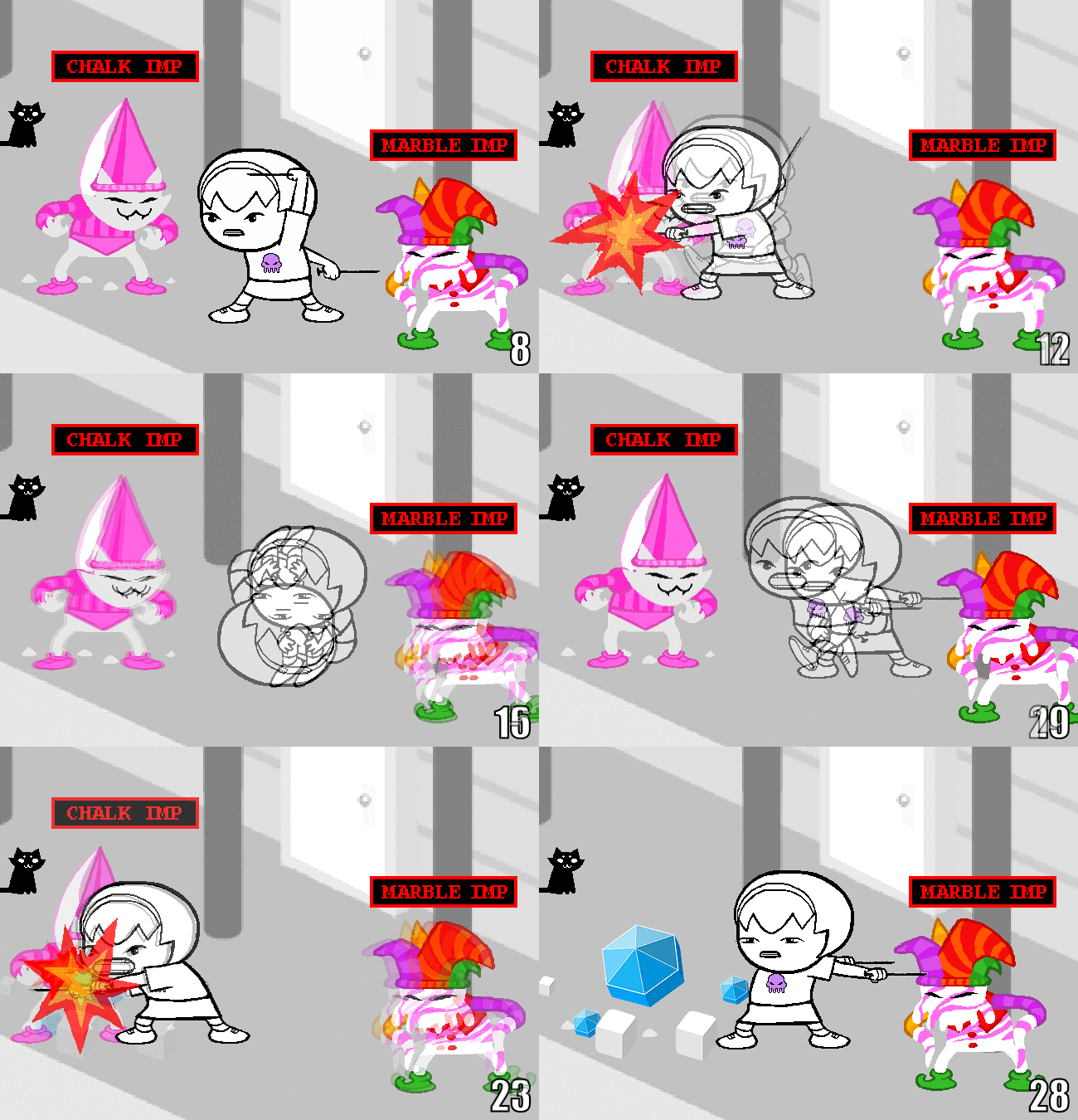
(The way Rose is pushed away from the imp, roughly ~13 frames in, kinda reminds me of bumping into friendly teammates in Team Fortress 2. If you know you know.)
Still on the topic of constant motion, imagine is the Marble imp didn’t move at all during all the frames where it isn’t Rose’s target, just standing around like a dummy.
You can see how it backs away after her first attack, then inches closer quickly with its right leg once she’s back in the Chalk imp’s grill.
For frames 28-57, all showing pure Marble-oriented violence, I wanna talk about hold frames.
I’ve touched on this- and used this very page as an example- in my Basics of MSPA animation article, but that’s no reason not to revel in how well done they are here.
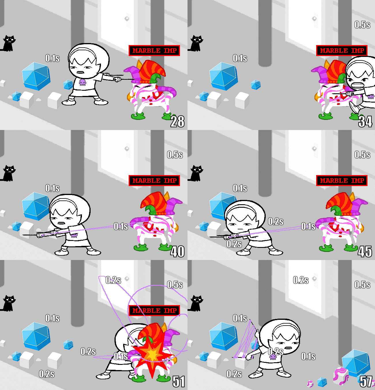

The right example has an added half second on every hold frame.
On the details on the GIF, the string weaving specifically, what can I say except wow.
This kind of attention to details is so rare in the average MSPA panel, but look how much it adds.
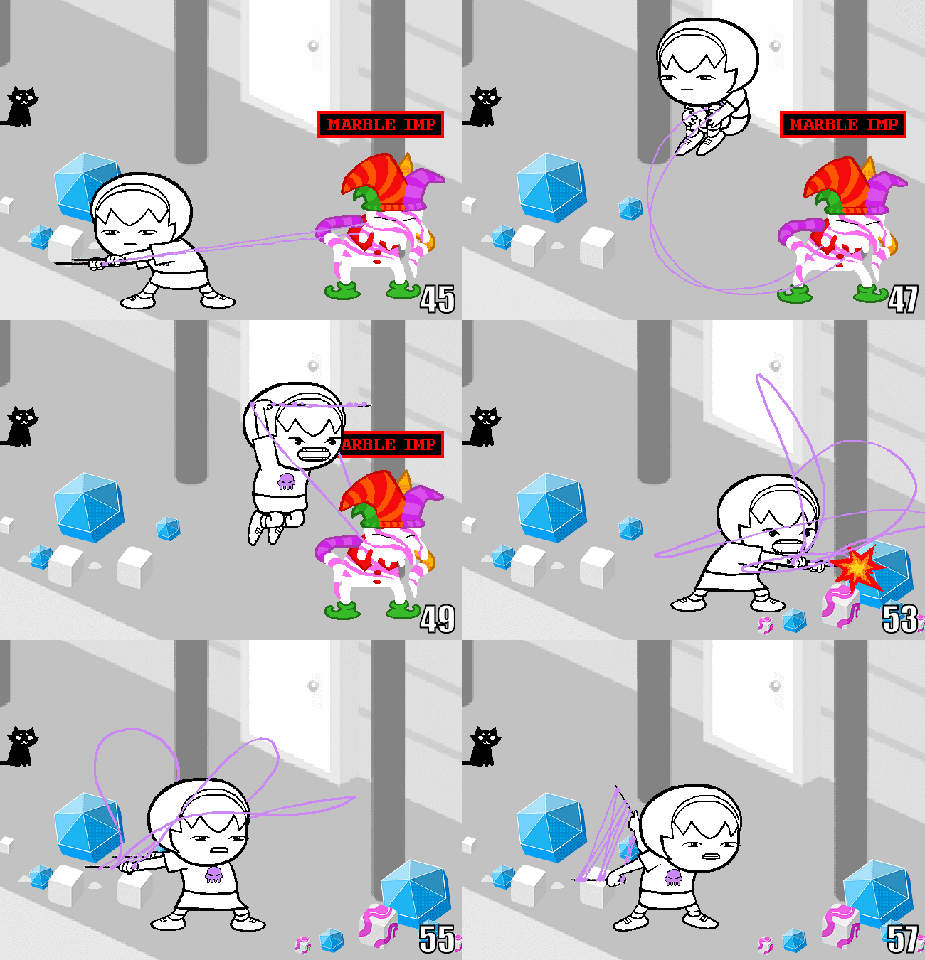
Consistency like line widths isn't the most important thing ever, so this just flies by so effortlessly.
You can even see Rose, at around frame 54, noticing how the line is going around her own neck, and promptly flicking the thread upwards a frame later.
To finish off: Excellent panel, tremendous effort to keep things fluid, A+ use of spritesheets/layer folders, and shining example of what extra effects do to liven a panel.
Probably the best animated panel in the comic.